A Designer's Honest First Look at Claude Design: No Prep, No Expertise, No Filter
I already use AI. But using it and understanding it are two different things. There's a gap between the prompts I type every day and everything I know I'm missing. New tools, new workflows, new ways of thinking about design that I haven't had the time or structure to explore.
So I decided to hold myself accountable. I'm documenting a micro-learning track where I go deeper, one session at a time. No curriculum, no certification, no guarantee I'll do this every day. Just a designer making time to learn in public.
Day 1 did not go the way I expected.
The Plan
My first session was simple: What is Claude's design tool?
I'd heard Anthropic had released something new. I had no idea what it actually did. I work primarily from the Claude desktop app on my Mac and the Android app on my phone, and I had no idea I even had access to a design product until I opened a browser.
That's where things started getting interesting.
First Stop: Claude Chat (Not the Right Tool)
Before I found Claude Design, I started where I always start. In Claude chat. I asked it to build me a segmented control component. Cards, Table, List. Three buttons. All states. Accessible. Responsive.
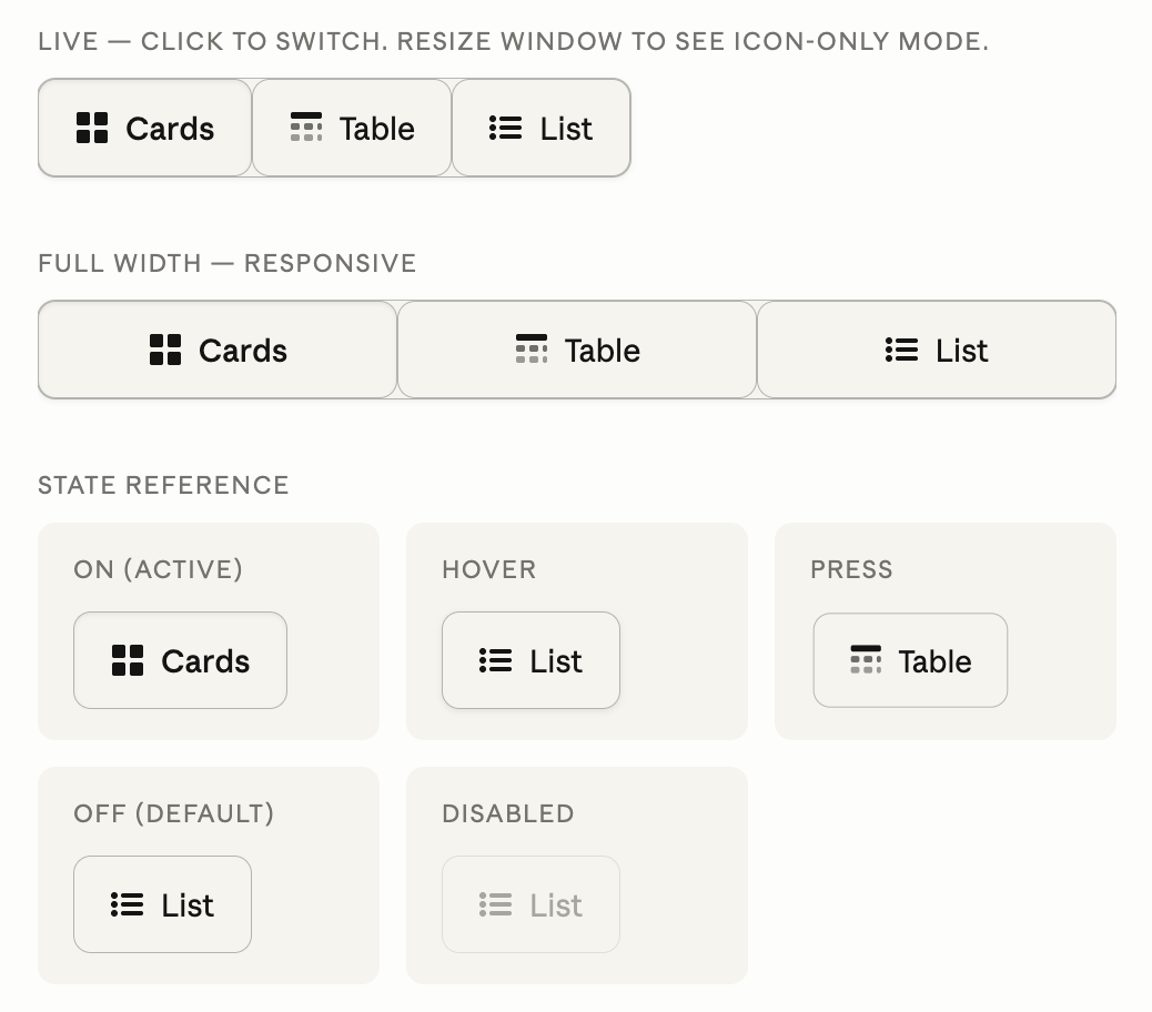
Four iterations in Claude chat to build one segmented control. It never fully got there.
What followed was four iterations of me describing what was wrong and Claude trying to fix it. The corners were always rounded when they shouldn't be. The states looked identical. The active state had no color fill. We went around in circles.
Here's the thing: I could have built this in Figma faster. Much faster. And after all those iterations, the output still wasn't right.
That frustration turned out to be the most useful part of the session.
Finding Claude Design
Buried in the browser version of Claude is a navigation item called Design. I almost missed it entirely. If you work from the desktop app or mobile, you won't see it at all. Claude Design is browser-only as of May 2026.
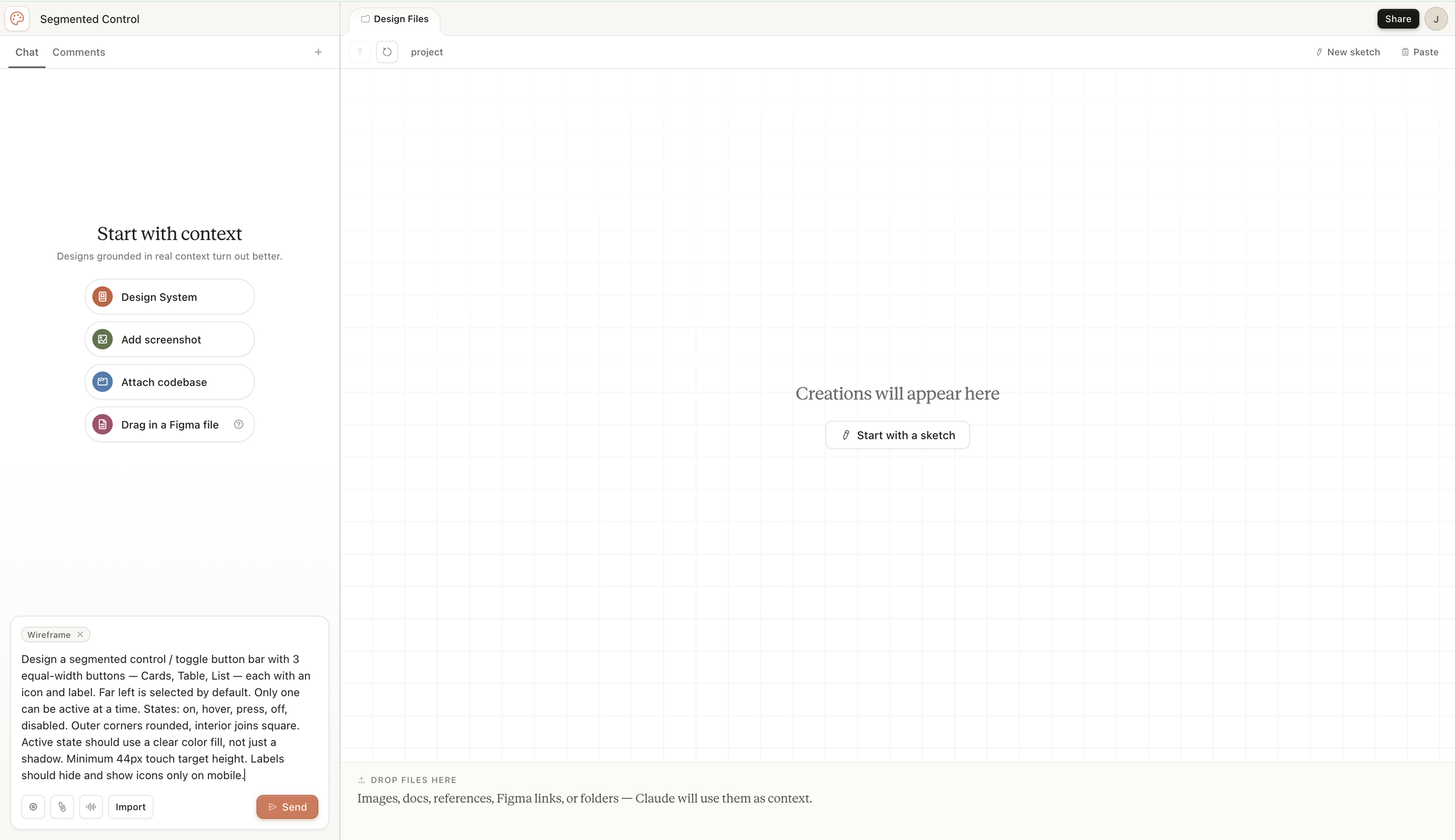
The Claude Design start screen prompts you to add context before you even type a prompt. Design System, screenshot, codebase, or Figma file.
The interface is immediately different from Claude chat. There's a canvas on the right and a chat panel on the left. Before you even type a prompt, it's asking you to provide context. A design system, a screenshot, a codebase, a Figma file.
This is not a chatbot that renders HTML. This is a design tool with conversation built in. That distinction matters more than it sounds.
I wanted a clean experiment, so I skipped the context step, selected Wireframe mode, pasted the same prompt I'd used in Claude chat, and hit Send.
What Happened Next Stopped Me
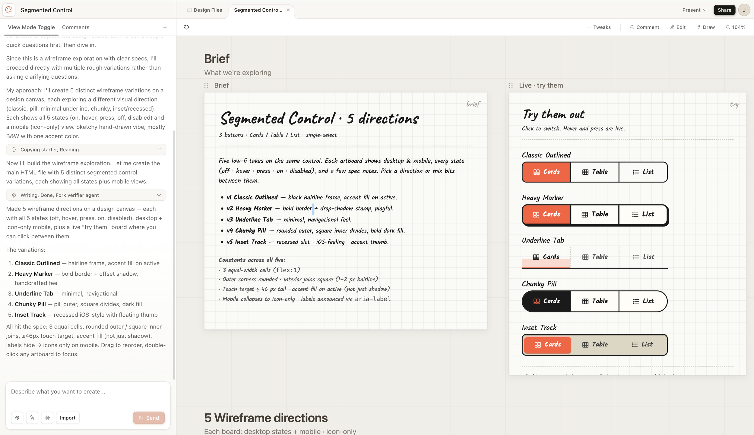
One prompt, one send. Five named wireframe directions with all states, desktop and mobile views, and a live interactive panel.
One prompt. One send. Five distinct wireframe directions, each with a named design rationale, all states shown, desktop and mobile views, and a live panel where I could click and interact with all five versions at the same time.
Compare that to four iterations in chat where I never fully nailed even one version.
The difference isn't just speed. It's role. In Claude chat, I was a design director managing a junior developer who kept getting the details wrong. In Claude Design, it felt more like a mid-level designer had read my brief, made smart interpretations, and handed me options to react to.
"Reacting is what designers are trained to do. Generating five directions from scratch takes hours. Evaluating five directions takes minutes."
Exploring the Tools
This is where things got messier. And more honest.
Tweaks
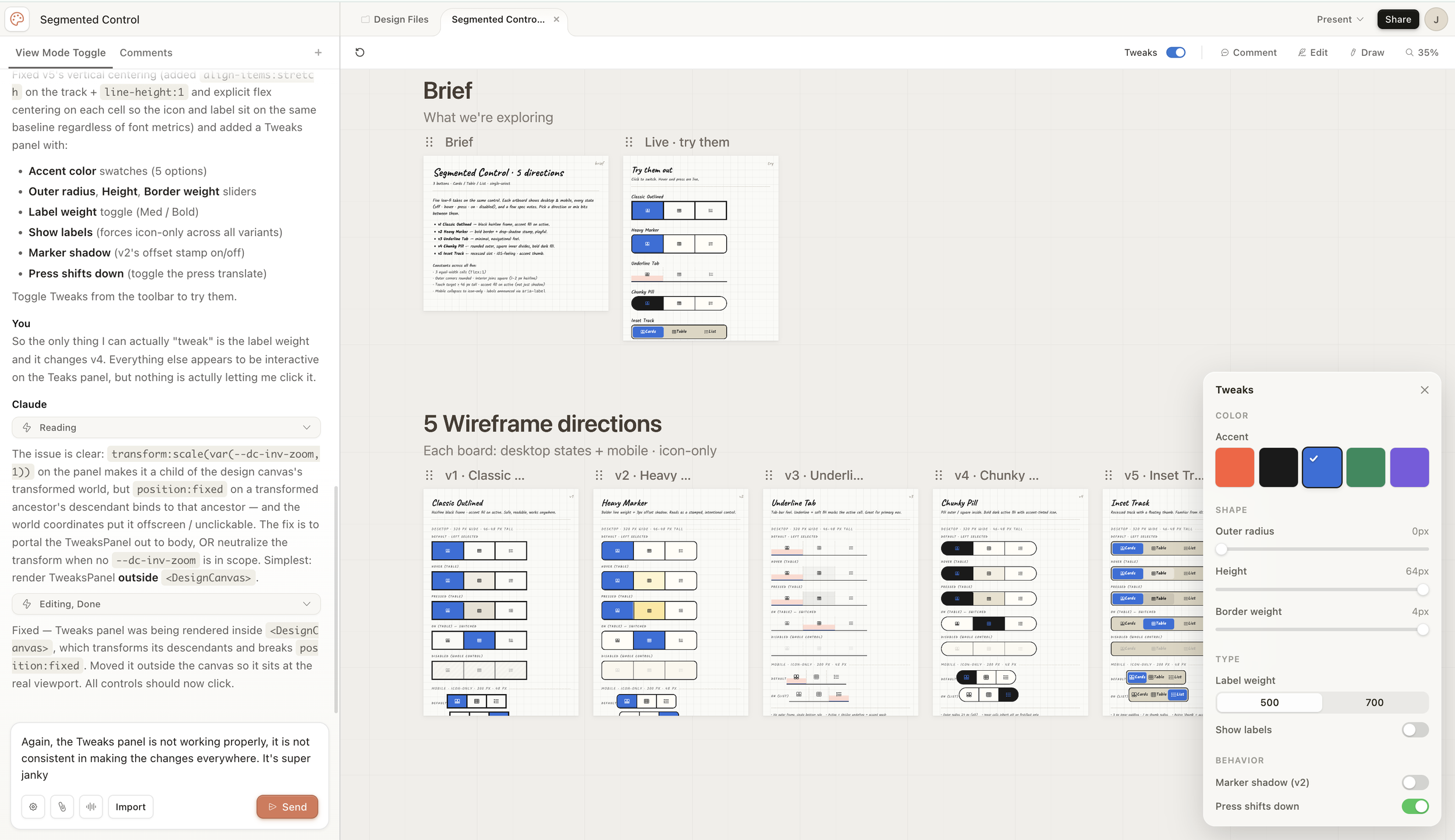
The Tweaks panel generates custom controls based on your specific problem. Color swatches, sliders, toggles — all built on demand.
The Tweaks panel is genuinely clever in concept. Claude reads your problem and generates custom controls relevant to your specific design. Color swatches, radius sliders, height controls, label weight toggles. It builds these on demand, not from a preset menu.
In practice it was inconsistent. Changes applied to some artboards but not others. I had to zoom out just to see what was actually being tweaked. The scope was never clear. Are you changing all variants or just one?
The most interesting moment came when I complained about not being able to control the drop shadow on v5. Claude didn't just adjust a value. It added a brand new slider to the Tweaks panel that hadn't existed before. It built the control I needed after I described the problem.
That's either impressive or unsettling. Honestly, it was a bit of both.
Comment vs. Tweaks vs. Chat
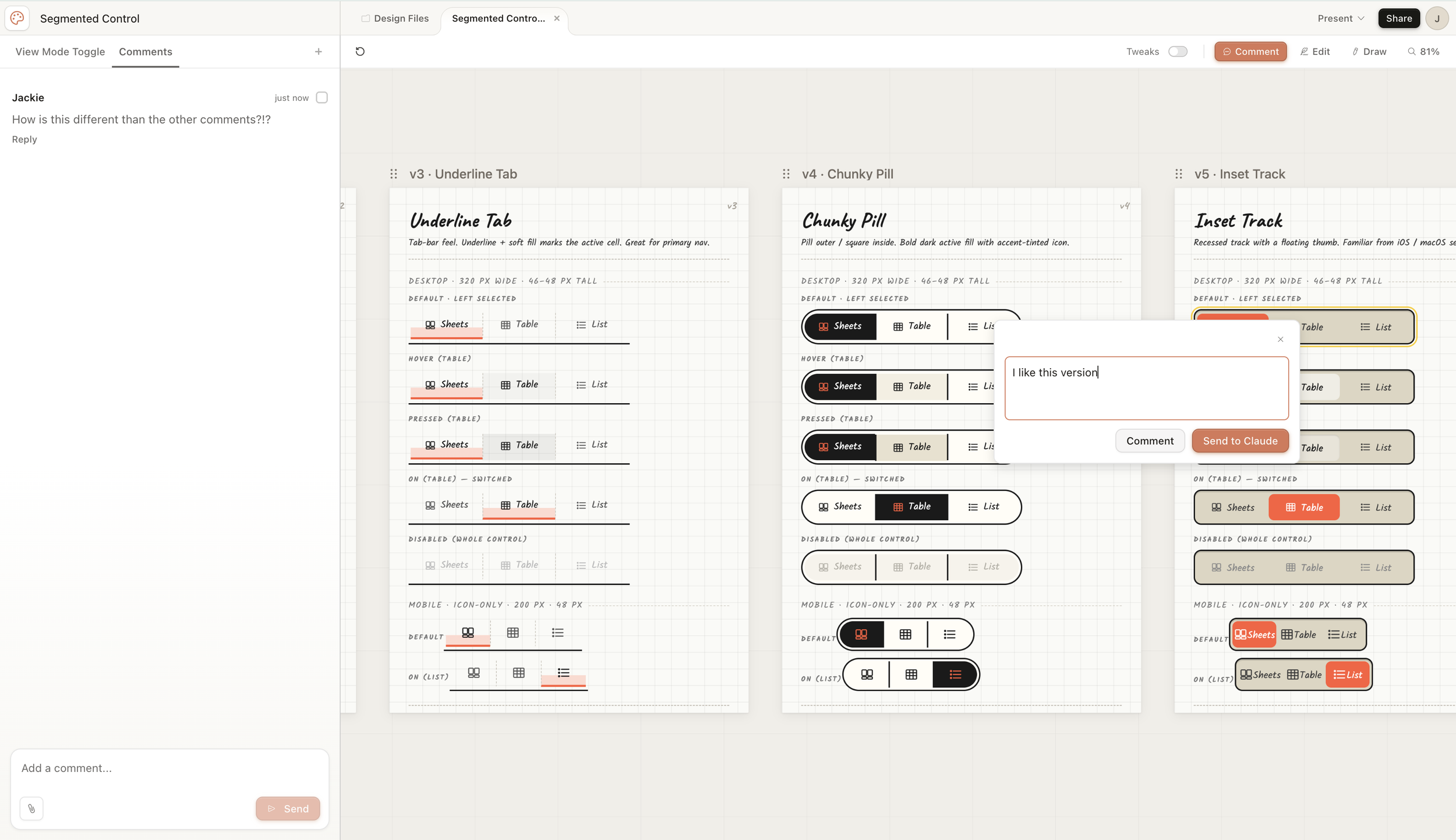
Three ways to give feedback, none of them clearly distinct from each other. Comment, Tweaks, and the main chat all feel like the same tool.
There are at least three ways to give feedback in Claude Design. The left chat panel, the canvas Comment popover, and the Comments tab. I still don't fully understand how they differ. My comment "I like this version" appeared anchored to an artboard but wasn't visible in the Comments feed.
This is a real collaboration gap. If I share this with a developer or stakeholder and they leave a comment, neither of us will know exactly what they're reacting to.
Edit
Edit mode lets you click into the canvas and inspect elements like a lightweight property panel. Typography, size, fill, padding, radius. It's closer to Figma's right panel than a full design tool. I couldn't find where shadows lived, which was frustrating. The parent-child relationships between elements weren't obvious.
Draw
I still don't fully know what this does. You get a pencil tool and a note field. My best guess is that sketches are saved as image references Claude can read. The UX didn't make this clear, and I couldn't find plain-language documentation to explain it.
Going Hi-Fi
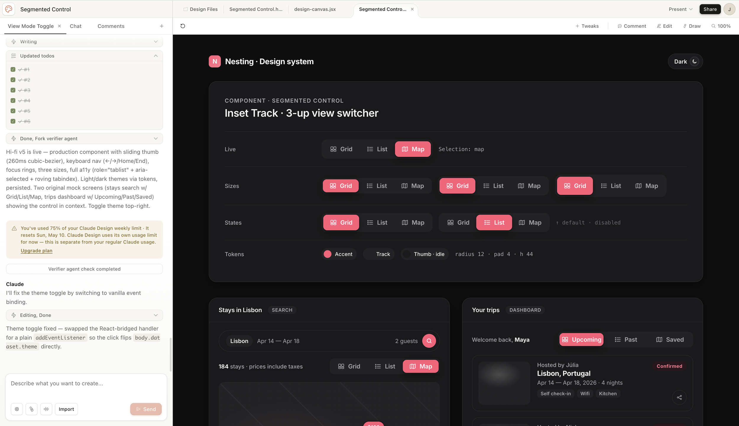
The hi-fi output included a full component spec with sizes, states, tokens, and accessibility notes. One prompt to get here from the wireframe stage.
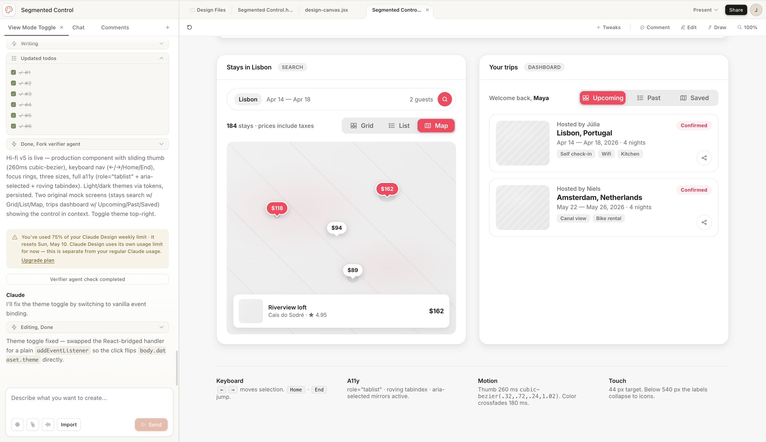
Two interactive mock screens in Airbnb's visual language, light and dark mode, generated from a single direction prompt.
After exploring the wireframe tools, I asked Claude how to move toward a high-fidelity version. It walked me through its plan, confirmed my choices (v5 Inset Track, Airbnb aesthetic, light and dark mode, real mock screens) and built it.
What came back was genuinely impressive. A component spec sheet with sizes, states, tokens, and accessibility notes. Two interactive mock screens styled in Airbnb's visual language. A working light and dark toggle. All interactive. (Claude was honest and said it couldn’t copy AirBnB due to copyright infringement, so it’s AirBnB-like.)
Things I lost in translation: hover states weren't as distinct, I'm not confident the contrast ratios fully meet WCAG AA, and the touch target height we'd discussed earlier didn't carry forward.
Then came the warning. You've used 75% of your Claude Design weekly limit.
No preview. No cost estimate before I started. One component exploration, wireframe through hi-fi, burned most of my weekly allocation. For a single component.
Claude Design never asked me what I was trying to accomplish. It never told me what to expect or how heavy certain requests would be. I only found out the cost difference between wireframe explorations and hi-fi rebuilds after the fact. Going forward my workaround might be to use Claude chat to plan the session before going into Claude Design to execute it. That way I'm not making expensive mistakes while figuring out what I want. Though I'll be honest, that sounds exhausting, and it probably shouldn't be necessary.
I also don't know whether different subscription plans come with different credit limits. That's worth researching before committing to this as a regular workflow tool.
The Question That Actually Matters
Here's where I landed after a few hours with the tool.
The work Claude Design does well is impressive. Wireframe exploration, component spec sheets, hi-fi prototypes in context. It's also work that established design teams already know how to do. Teams have invested in design systems, component libraries, and documentation processes for years. Pulling from an open-source system like Material or Fluent and building on top of it doesn't cost AI credits.
So the question isn't whether Claude Design can do this work. It's when it should.
There are two different arguments for AI in design right now.
The first is AI as a skill replacement. Use it to do commodity work faster. Wireframes, spec sheets, component libraries. Things that exist, that teams know how to do, that just take time.
The second is AI as a capability expander. Use it to do things you literally couldn't do before. Explore 20 directions instead of 3. Prototype an idea before the meeting ends. Reason about constraints you couldn't hold in your head all at once.
Most of today's experience fell into the first category.
The moment I kept coming back to was a project from a few years ago. I was leading a team designing software for physical hardware. The screen changed orientation and size three times. Each time, we had to start over. Not because we didn't know how to design, but because the intent behind every layout decision lived only in our heads. There was no way to say "here's what this design is trying to accomplish" and have anything re-derive it when the hardware spec changed.
That's where AI could genuinely change outcomes and not just speed. Not "build me a button bar" but "here are our design principles, here's what changed, what needs to be reconsidered and what can stay?"
"That capability doesn't fully exist yet in any tool, including Claude Design. But it's the right question to be working toward."
What I'd Tell Another Designer
Claude Design is worth trying, especially if you have access through a Pro or Max subscription and a browser. Go in with the right expectations.
Use it for exploration, not refinement. The first output is often impressive. Getting it exactly right takes longer than you'd expect.
The feedback tools are still rough. Tweaks, Comment, Edit, and Draw overlap in confusing ways. Use the main chat for broad changes and treat the other tools as supplements.
Watch your credits. There's no cost preview and the usage is opaque. Wireframe explorations are lighter. Hi-fi rebuilds are heavy.
The handoff story is interesting. You can export to HTML, PPTX, PDF, Canva, or directly to Claude Code. That last path is where Anthropic seems to be pointing designers toward building.
And keep in mind: I only tested a component. That's a narrow use case. If I had brought a more complex scenario into Claude Design, given it real constraints and design principles and asked it to reason through a layout change, maybe the experience would have been completely different. I don't know yet. That's a future session.
"I learned more about what AI design tools can't do by using one for three hours than I'd learned from months of reading about them."
That's why I'm doing this in public.
This is Session 1 of a self-directed AI learning track. I'm documenting it as I go — the wins, the confusion, and the questions I can't answer yet. No promises on frequency. If you're a designer trying to figure out where AI fits in your practice, come along.