Omnicell ADC
Four teams.
One device.
Nobody owned
the seam.
Hardware decisions were being made that would permanently constrain what the interface could do — and nobody had asked what any of it meant for the software experience. This is the story of how I made myself the person who owned that gap.
The brief wasn't wrong. Nobody who wrote it had been in the room.
What I walked into
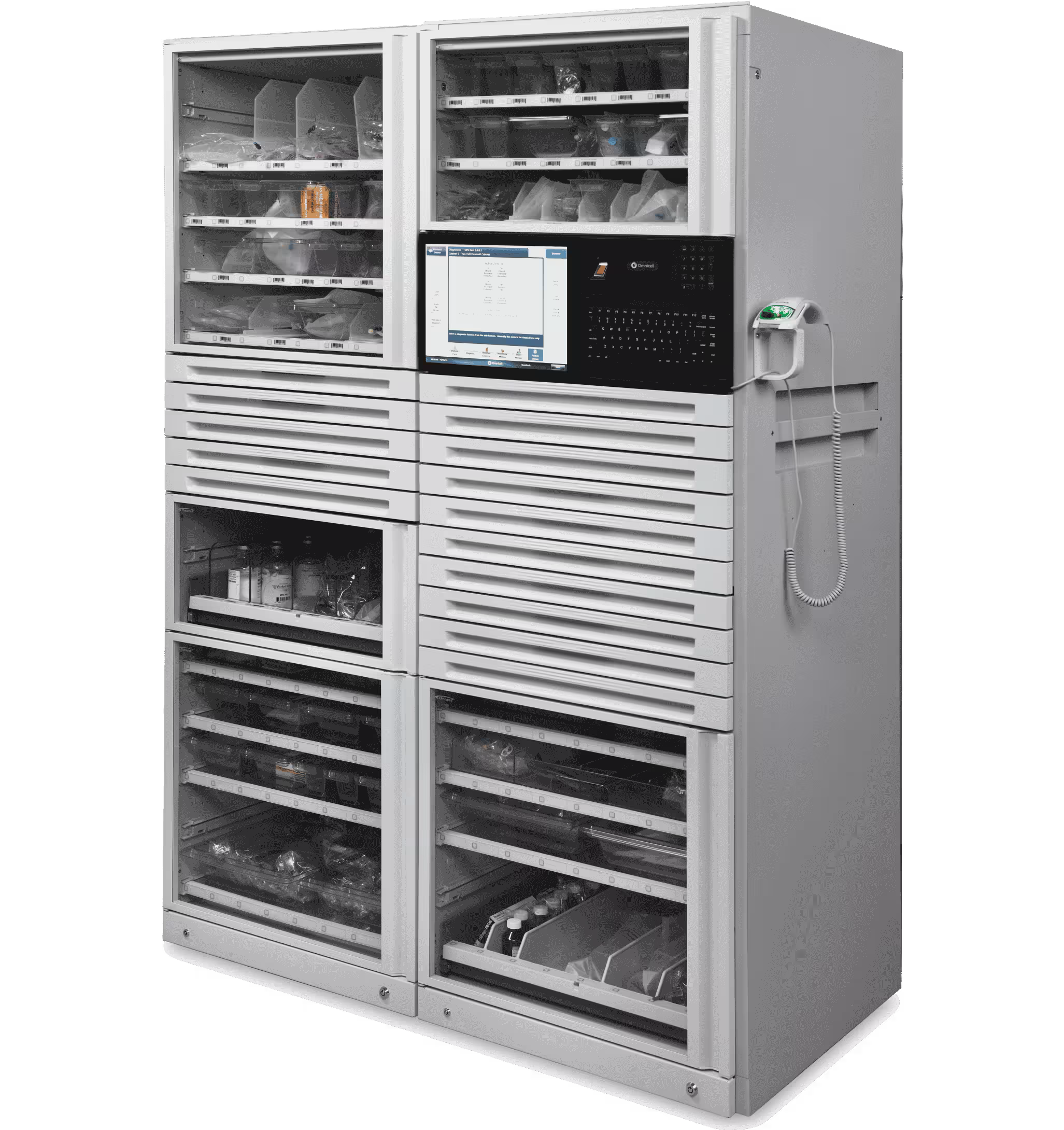
When I joined Omnicell I was brought in to lead SaaS UX. A few months later I was reorged and ended up owning the entire Point of Care product line — including the next-generation Automated Dispensing Cabinet redesign already in motion.
Four teams were working on one device with no shared view of the full experience. Industrial design was an outside firm. Electrical engineering was the bridge between hardware and software. Two scrum teams split pharmacy and nursing workflows. By the time I was in the room, hardware decisions had already been made with UI implications nobody had mapped.
The tracks were being laid while the train was moving. Multiple form factor concepts in play simultaneously — different screen sizes, orientations, surface materials, input methods. None of it decided. All of it consequential for the software.


Multiple hardware form factor concepts in play simultaneously — each one a permanent constraint on what the software could do.
I don't design from a desk.
Site visits · Omnicell · 2020–2024
Redesigning hardware with a decade-long lifecycle isn't a desk job. I went on-site, gowned up, and spent time watching how people actually used this hardware in live hospital pharmacies and nursing stations.
What you see here tells the story before I say a word: a tethered scanner, a keyboard next to the screen, someone reaching up into a cabinet with both hands occupied. Everything observed in those visits shaped every interface decision that followed.
Environmental conditions weren't edge cases — they were the spec. Overhead fluorescent lighting. Noise. Physical display positioning. Gloved hands. Users who are never fully stopped when they interact with the screen.

On-site contextual inquiry in live hospital pharmacies. Environmental conditions — lighting, noise, display position — shaped every interface decision.
Not a research deliverable. An alignment tool.
Service blueprint · Built without being asked
I built a service blueprint that nobody asked for. Three swim lanes — user actions, hardware, and software — mapped across every workflow the device was part of.
The device had one job: meds in, meds out. A drawer opens, someone puts something in or takes something out, and the system tracks it. Simple mental model. But when you laid the blueprint out, no single team owned that full loop. The hardware team owned the drawer. The software team owned the screen. Nobody owned what happened in between.
That's the seam. The blueprint made it visible for the first time. Every team was suddenly looking at the same device doing the same job — not their piece of it, all of it. Once you can see the seam, you can own it. That's what the blueprint was for. Not documentation. Alignment.
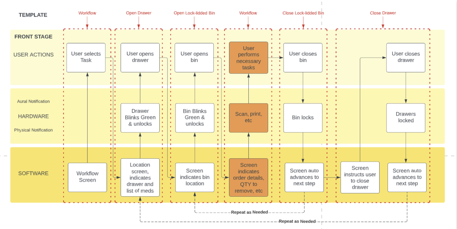
Three swim lanes. One template. Applied to every workflow across every user type.
The environment had opinions. We had to listen to them.
Physical environment testing · Screen sizes, glare, viewing angles, touch targets
The blueprint told us what questions to ask. The environment told us what the answers had to be. We tested screen sizes and orientations mounted on actual cabinets — not in a lab, on the hardware itself.
We looked at glare from overhead fluorescent lighting. We tested viewing angles because the person reading this screen is rarely standing directly in front of it. We did smudge tests. We looked at touch target sizes for people who weren't always able to stop moving to interact with the screen.
The environment had opinions and we had to listen to them. Our UI didn't always perform. That's what drove everything that came next.

A misread screen in this environment isn't a UX failure — it's a safety incident.
Unified doesn't mean identical.
Extending Greenlight — the existing design system — for a new physical context
The constraint was an existing design system — Greenlight — built for web and optimized for someone sitting at a desk with a mouse. The response wasn't to abandon it. It was to extend it.
Same tokens. Same components. But a kiosk-specific layer built on top. The environment is a design input, not a constraint to solve after the fact — and the design system had to encode that understanding by default, so any screen built on top of it inherited those constraints automatically.
Responsive web design wasn't the answer here. Responsive web design assumes a browser. This was a kiosk bolted to a wall in a medication room, operated by someone in gloves who has somewhere else to be in thirty seconds.


One design system. Extended — not replaced — for every surface.
Same screen. Three years of learning.
The Remove screen — a controlled substance interaction — evolved across three fundamentally different paradigms


The remove screen is a controlled substance interaction. The stakes are not abstract. The legacy screen had no hierarchy — everything the same size, the same visual weight, built around what the database needed to record rather than what the nurse needed to do.
V3 is organized around a single principle: glanceability under pressure. QTY dominates because a nurse pulling meds at 2am reads the number before anything else. Waste requirement surfaces inline, never behind a modal. Bin location is mapped spatially. Alert state surfaces without interrupting the workflow.

V3 started on a whiteboard. A question nobody had really answered cleanly: what does a nurse actually need to see when they're pulling a medication at 2am under pressure?
What I'd do differently.
Every reflection here is honest — these aren't lessons learned in retrospect, they're things I was advocating for in real time that ran into organizational resistance.