Omnicell Research
The system and the user were moving in opposite directions.
The system said: find the medication, put it here. The pharmacy tech had the medication already in hand and needed the system to tell them where to go. A wrong restock isn't a UX failure — it's a medication error. We went to hospitals with clipboards and stopwatches before we touched a single screen.

The system said find the med. The tech had the med.
A fundamental mental model mismatch
The restocking workflow was designed around a simple logic: here is a list of medications that need to be restocked, find each one and put it in the right bin. The system was the source of truth. The user followed its instructions.
But that's not how pharmacy techs actually worked. They arrived at the cabinet with a full cart of medications already picked and bagged by the central pharmacy. They weren't searching for a medication — they had it. They needed the system to tell them where it went, not the other way around.
The system and the tech were moving in opposite directions. Every wrong restock started here — not with user error, but with a design that assumed the wrong mental model from the start.
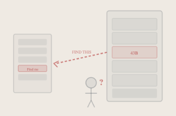
As designed: the system drives the user. As built: the user drives the system. Opposite directions.
We didn't figure this out in a conference room.
Site visits · Field observation · Multiple facilities
We went to the hospitals. We watched pharmacy techs work. Two observations changed everything.
First: techs arrived with a full cart of medications already picked and bagged by the pharmacy. They weren't looking for a medication — they had it on their cart. The system assumed they'd be searching. They weren't.
Second: smaller technicians were physically walking around open drawers to read bin labels, touch the screen, reach the keyboard, then back around to the cart. The system assumed a body type and a room orientation that didn't match reality.
The technology needed to meet them where they already were physically — not the other way around.

The scanner was already in their hand. The cart was already full. The system assumed the opposite of both.
We measured before we designed.
Time and motion studies · Multiple facilities · Multiple techs
Field observations told us what was happening. Time studies told us how much it mattered. We went back to those same environments with clipboards and stopwatches — multiple facilities, multiple techs, different routes, different med types, different storage configurations.
The average restock time was 6.3 minutes per 10 medications. But the average isn't the finding. The finding is the variance. It spikes and drops within the same hospital, across different techs doing the same task in the same room on the same day.
An unstable process means the design hasn't solved the problem yet. The variance is the signal. That data gave us permission to make the design decisions that followed.


Not a survey. Not a usability test. Someone standing next to a tech with a clipboard timing every motion.
average restock time
with multiple techs each
the real signal
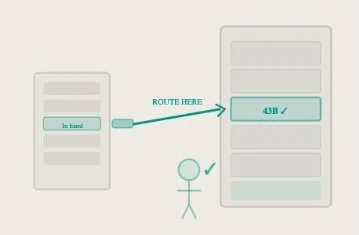
The scanner was already in their hand. Meet them there.
Scan-first routing · Two entry points · System optimizes the path
The solution was to meet the tech where they already were — physically and cognitively. We gave them two entry points: scan first or list first, their choice.
The scanner was already in their hand, so we made it the primary input. Scan a medication and the system routes to the right bin. No searching, no cross-referencing. The system optimizes the path and the scanner advances the screen with no unnecessary steps.
From there the technician could follow the screen and restock other meds in that same drawer, or scan the next med and have the system tell them exactly where it goes. Same destination. The tech chooses the starting point. The complexity didn't disappear — the tech just stopped noticing it. That's successful safety-critical UX.

Same destination. Tech chooses the starting point. System optimizes the path. Scanner advances the screen — no unnecessary steps.
The goal wasn't faster restocking. It was fewer collisions.
Four outcomes · Accuracy · Efficiency · Availability · Safety
The complexity didn't disappear. The tech stopped noticing it. That's what successful safety-critical UX looks like — not a simpler system, but a system whose complexity is invisible because it's working with how people actually think and move.
Faster and safer are not in tension here. When you design around how people actually work, in the environment they actually work in, you get both.
What I'd do differently.
The insight here was right. What took longer than it should have was getting the organizational support to act on it at the strategy level.